User research
When I joined, existing interfaces and concepts needed a thorough evaluation.
User research had two goals:
- Test how effective current interfaces and concepts were.
- Learn more about target users, who were still poorly understood.
I prepared, organised, and ran about ten user tests. They helped identify three archetypes:
Hockey experts Competitive and passionate, they know the sport inside out and play to win.
Regular fans They follow hockey with interest and seek a balance between fun and performance.
Social participants They enjoy hockey mainly for fun and social interaction, with a less competitive mindset.
Problems
After this research phase, several major issues emerged.
- Onboarding does not explain key features and app benefits clearly enough.
- The home experience lacks clarity and engagement.
- Users struggle to understand and assess player performance.
- Portfolio management feels too complex.
- In-app navigation causes confusion.

Solution
After identifying these issues, I proposed solutions to improve the experience. They were presented to the client, validated, and prioritised to guide the redesign.

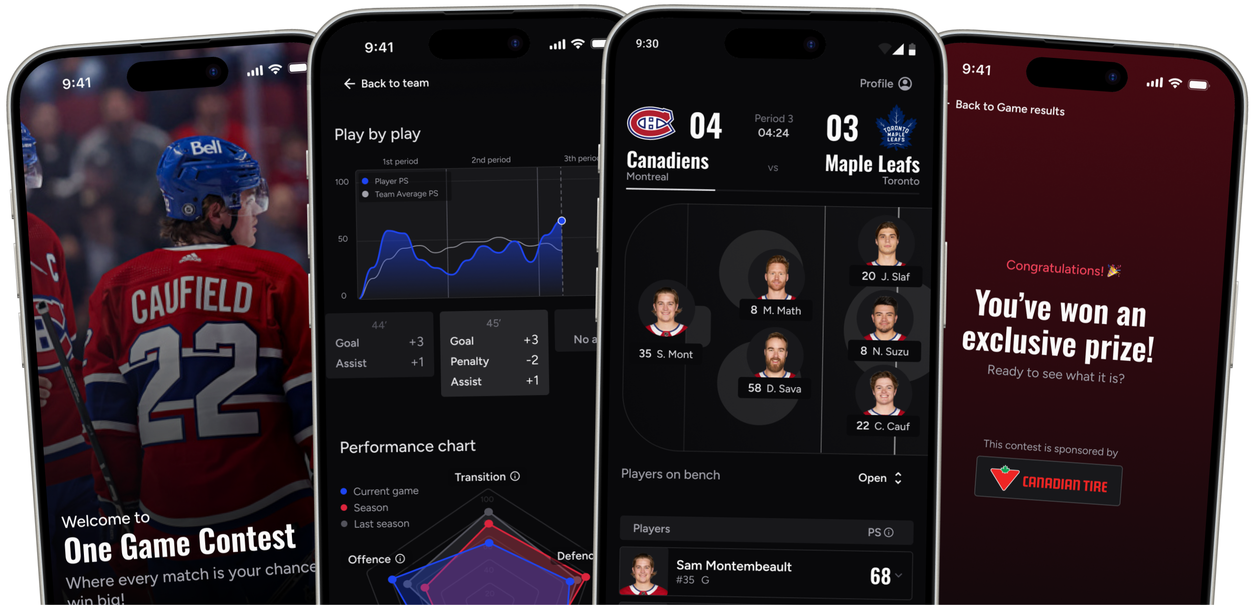
Putting action at the heart of the app
The page formerly called “On Ice”, showing live players, became the main screen. Users are dropped straight into the action from their first moments in the app.

Simplifying the player scoring system
- Clarified the scoring system for easier understanding.
- Simplified performance charts to make them more accessible and intuitive.
- Added a help icon with clear, concise explanations of the data shown.


Improving copywriting
Replaced trading- and finance-heavy terms with vocabulary closer to sport and gaming.

Adding value to onboarding
A clearer, more engaging introduction for new users.
Progressive discovery of features for a smoother, more interactive experience.

Project outcomes
This project let me combine varied skills in design and product strategy. The OGP redesign produced a more engaging, intuitive experience aligned with research findings.
Design system
To keep visuals and behaviour consistent across the app, I built a structured design system.


Key figures
Client feedback
This project was a rewarding experience that let me combine design and product strategy. The OGC redesign led to a more engaging, intuitive experience aligned with research findings.
Pierre is a designer who exceeds expectations, combining rigour and passion in everything he does. Working alongside him was a pleasure. He led this project with excellence, mastering execution, strategy, and client relationships. His commitment and vision make him invaluable to any team.
Pierre and the Puxxle team were essential to OGC’s initial design, bringing innovative UX/UI solutions grounded in thorough research that greatly helped our startup ProInvest move forward.
Thank you for reading!